Contact Form Design: Dos and Don’ts
Are you aiming for a high-converting design for your contact form? Here’s a list of do’s and don’ts that will help you design the perfect contact form.
Pro Tip: By the end of this read, if you’re looking for an easier way to create your form without coding it, try our free contact form generator. If you still want to get your hands dirty with coding, we’ve got an HTML contact form code tutorial that you can follow.
Do’s
Hospitality is never out of style
You can never be too polite. Use a friendly tone and an overall human approach, especially when you provide customer support. Be personal when trying to connect. After all, you’re asking for users’ personal data, so they should rest assured there’s a human being behind that Submit button.
Choose your own approach
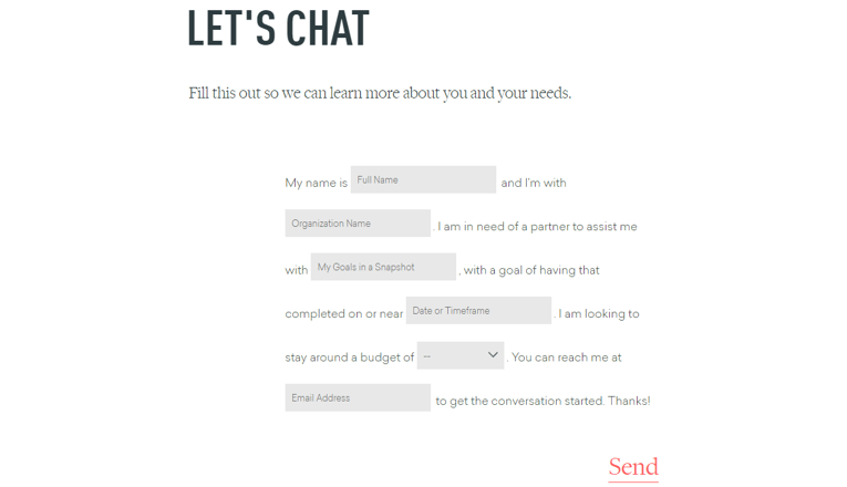
The contact form design should be straightforward, it’s true. However, there are a few that stick with you because they are exactly the opposite of what one would expect. Don’t be afraid to go for a different style, like this interactive PDF-like form design example that Focus Lab uses:
Spark some interest
Use an incentive. Provide value to make your visitors get in touch, by showing them what they gain by submitting their info. For instance, some subscriber benefits, e.g. exclusive promotions, coupon codes, and more.
Embrace UX principles
When you design your contact form, make sure you keep the user’s journey in mind. Make it intuitive and group questions logically. Also, vertically, since users seem to prefer one-column forms.
When your business covers many regions and customers should be redirected to specific departments depending on their issue, use a step-by-step model.
Also, it’s important to consider that your form will be accessed by people with disabilities as well (e.g. blind people), so the contents should be accessible to screen readers.
Make your form mobile
It should go without saying that we’re living in an increasingly mobile world. So when you expect people to contact you, you should consider the type of device they use and be prepared to welcome them all.
Best practices for mobile-optimized contact forms include: opting for fewer fields, using auto-focus on the first field, placing labels above the fields, using the “show password” option to avoid mistypes, replacing dropdowns with radio buttons, and allow sufficient spacing between elements.
Put some meat on Submit
Get creative with your Submit button. While it’s true users respond better to rectangular buttons, if your website strives for artistry, there’s no reason why you shouldn’t experiment with a circular-shaped button. There are no limitations color-wise either, you just need to find a nice contrast and test which button color converts best for your business.
Also, pay attention to your copy. Avoid “Submit” and find friendlier alternatives, e.g. “Get started for free”, “Talk to us”, “Subscribe today” and so on.
Personalize your automatic responses
After filling out your contact form, users see an autoresponder or get redirected to a Thank You page. With an HTML form generator such as 123FormBuilder, you can customize each of these options in order to create a warmer environment for those who expect an answer from you.
In an autoresponder, make sure you let people know what is your average response time, in order to set realistic expectations.
Pro Tip: Don’t forget to write auto-reply messages that will impress your form submitters once they fill in your contact form. Here are some automatic email response examples for your form.
On the Thank You page you can post a text, a funny image or GIF, a link to a resources page, a helpful download, or anything else that will grow user engagement. Here’s why you need a thank you for your contact form.
Pro Tip: Designing a good Thank You page and writing a compelling form success message goes a long way. Don’t skip the Thank You, ever.
Lost for ideas on what exactly to write on your Thank You message? We have some pretty good ideas for you:
Inspiring Thank You messages your forms should have
Don’ts
The hard-to-get contact form
If people need to scroll and click too much to find your contact form, it’s a sign you need to rethink the user journey. It’s only human to expect to find the contact area easily (or figure out how to navigate the website); otherwise, they will leave.
Don’t make them think
It’s nice to be creative, but it’s more important to be relevant. Tell people why they should get in touch. Using a clear copy above your form is the perfect way to do it. So, before even thinking about the best design for your future contact form, you should define a purpose.
Aren’t you asking for too much?
No one likes to fill out forms. It’s just a necessary step to go through when people need to connect with a company. So when designing your contact form, make sure you only ask for the information you absolutely need. Actually, according to Hubspot, the best performing form length in 2019 is 5 fields. On that same note, regardless of the number of fields you work with, don’t make them all mandatory.
Don’t forget data validation
Save your users some time and get error-free input. Provide hints on the right data format on the go instead of showing error messages after a user has filled out his/her information. For instance, you can require a certain format for information such as email, phone number, date, or website.
Is it time to redesign your Contact Us page altogether?
So you’ve built your perfect contact form. It can’t, however, stand on its own. You need a creative Contact Us page to build trust in your brand and get more people to connect.
While it’s easier to just place a form on this page – and more often than not, less really is more – you might want to add a few tweaks to make the contact page design more attractive and persuasive.
Pro Tip: Focus on your contact form placement carefully. Do you use the form to gather business leads or improve your customer service? Consider placing the form above the fold on your contact page. But also test the outcome.
Be unique
Needless to say, this doesn’t work for any type of brand. But when it’s possible, why not let your imagination go wild and create a page that sticks with your website visitors?
Choose either a minimalistic or a colorful approach, depending on what suits your brand best.
Pro Tip: You can polish your contact form with CSS – the sky is the limit! But using a form generator with CSS customization can save you time at making the form function correctly – no HTML and PHP headaches.
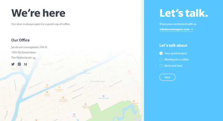
Use negative space to allow your contact details to catch the eye as Yummygum does.

Or visual cues to draw attention to certain elements on the page, e.g. flags if you have multiple offices or showrooms across the globe.
Win followers at no cost
If you’re sending emails to your audience, the contact page design should include a newsletter subscription section as well. Make it easy for users to join your mailing list and partake of your updates, as email marketing is still a powerful tool when used the right way. If you’re able to offer an incentive for new subscribers, that’s even better.
Location, location, location
I don’t know about others, but I find it unsettling not to know where a business is located. There are many ways to use maps or other elements that show users where your company is, even if you only have an online presence. Disclosing your whereabouts is one of the elements that build customer trust in your brand.
Enable visuals
Give life to your contact page by using animation, a video (e.g. from previous conferences, if you are an event organizer), or a header image of your team. Whatever you choose, your visuals should be authentic, like those used by Fentimans.
Tip: Try our free form designer to customize the looks of your contact form without coding.
Make sure that these elements, while engaging, don’t steal the space of your contact form, which shouldn’t be placed below the fold. After all, you don’t want your visitors to miss it!
Another thing that will probably never grow old is social proof. Displaying a handful of partner companies will inspire others to connect with you way more than any other sales effort.
If your product or service is aimed at individuals, encourage visitors to join your large community by showing off that big number next to your contact form.
Well, your company’s, to be more specific. The best contact pages I’ve seen use social media profiles (with branded buttons) to escort visitors on those platforms where they have the strongest presence.
Provide alternative ways to connect
Not everyone wants to send their data in. You can engage people in many other ways, such as placing a chat box at the bottom of your contact page to let users seek immediate assistance.
Depending on your field of activity, you may also resort to a phone number, email, a WhatsApp contact, or a forum.
Furthermore, if your company has different contact pages for different departments (e.g. Sales, Support, PR), segment them to point users in the right direction.
Pro Tip: Opt for a form builder with conditional logic that can segment messages and change the form’s layout based on user behavior. The best web form tools on the market offer this perk.
A few contact page designs I’ve reviewed provide a FAQ link or a Browse by Topic section to spare users the hassle of reporting an issue that was already addressed or help them find exactly what they need on your website.
The no-form contact page
After all, not every business considers a contact form mandatory. Some choose to provide other friendly connection alternatives, like Gucci, for example. You can find their phone number, live chat option or send an email if you prefer.
Conclusion
There are many methods to improve your contact form and contact page design and subsequently reap an increased conversion rate. However, ultimately each brand is unique and results might differ. This means that no matter what idea you come up with, you should test it out and measure the data before implementation, as well as planning a robust data management strategy.
To get the best performance out of your form, consider using a contact form builder such as ours.
Lastly, we provide a list of contact form templates that you can use as you see fit.
Load more...